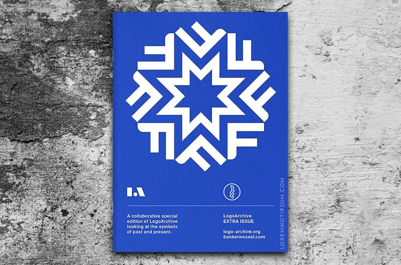
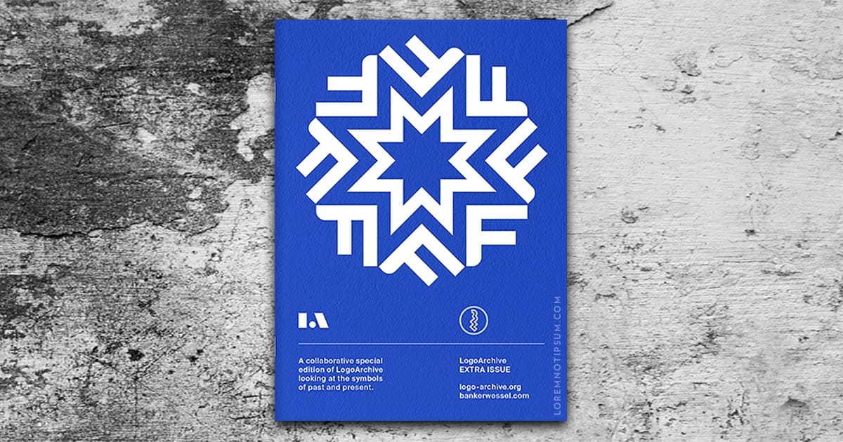
LogoArchive Extra Issue “Past and Present” is available now on loremnotipsum.com. LogoArchive was conceived, designed and sent to print in a day. It was inspired by a panel discussion at Somerset House as part of the exhibition Print! Tearing It Up.
Channeling the independent spirit of niche publishing LogoArchive seeks to surprise and delight within the context and practice of archival, iterating with each new issue. The distinctive smaller format has created a space for experimentation and collaboration, as well as opportunities to hand over the zine to those who also share a similar interest in symbols and corporate identity programmes of the past. BankerWessel is one such studio. Their brand identity work carries the spirit of mid-century form language into the future. This becomes the foundation of LogoArchive’s third Extra Issue.
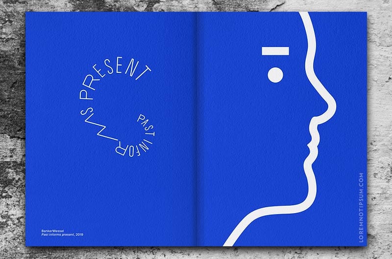
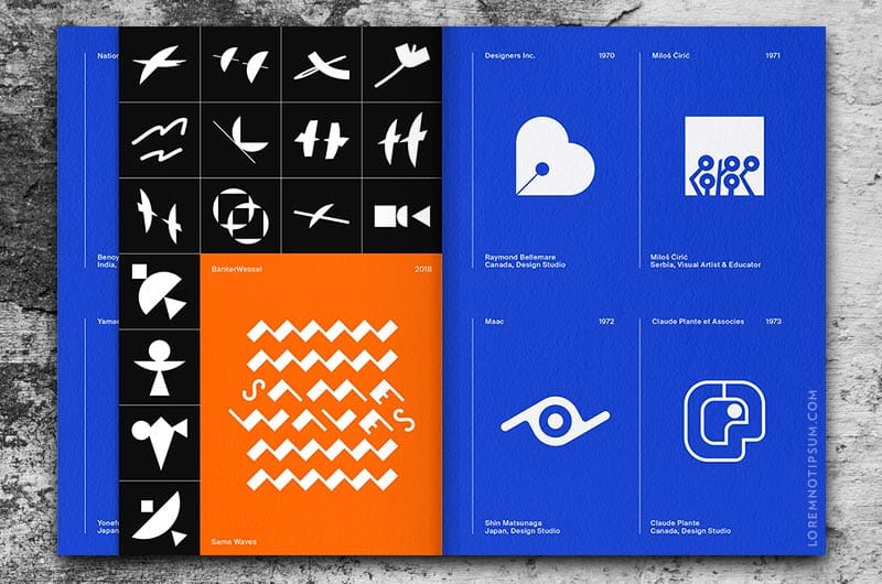
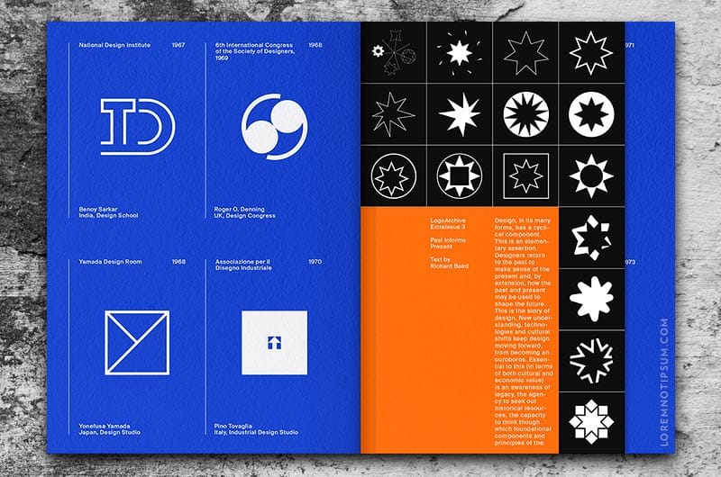
In the dialogue between booklet and insert (symbols past and present), two unique cover variations and the chronological sequence of BankerWessel’s own design process, this issue intends to be a small bookmark in time and a provocation to think about the iterative and cyclical nature of graphic design.
Both cover designs contain the same content.
LogoArchive is marked by its conceptual and philosophical foundations but also its graphic immediacy, an interplay between the visual language of archival and children’s storybooks, as well as its materiality and production. These reflect the pragmatism of documentation and the metaphorical play present in some of the logos, and LogoArchive’s digital origins as an Instagram account and its new material manifestation. LogoArchive is founded on an enthusiasm for a well-crafted logo; a convivial metaphor, a communicative immediacy and smart use of form language. However, in print, it was never conceived as a document with a singular intention; the simple documentation of logos, rather a delivery mode in which to build a story and share thoughts. A conversation on Twitter; digital dialogue lost in the passage of time but forever coded into the electronic aether, is materialised as ink on paper and written into the story and ongoing development of the zine. This sits alongside an anthropological text; a musing on the distinctive qualities of the human eye.
Details: LogoArchive Extra Issue “Past and Present”
Design: BankerWessel / Richard Baird / LogoArchive
Publisher: BP&O
Size: 148 x 210 mm
Booklet:
Pages: 10pp + Cover
Finish: White
Paper: Fedrigoni Sirio Iris 140gsm
Insert 1:
Pages: 8pp
Finish: White
Paper: Fedrigoni Sirio Arancio 115gsm
Insert 2:
Pages: 8pp
Finish: White
Paper: Fedrigoni Sirio Ultra Black 115gsm
Binding:
White Staples
