
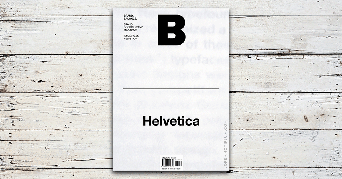
Magazine B – Issue 35 (Helvetica)
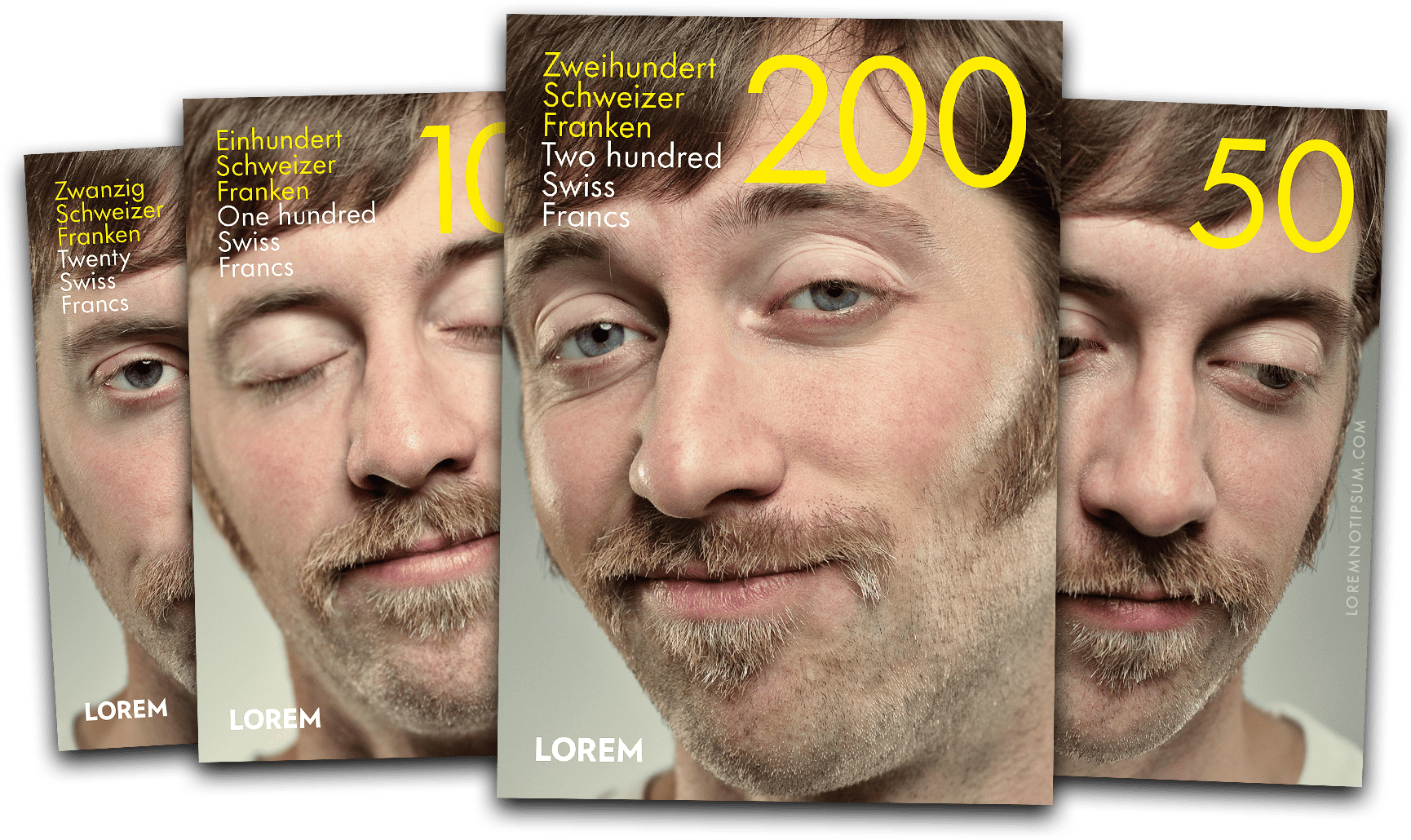
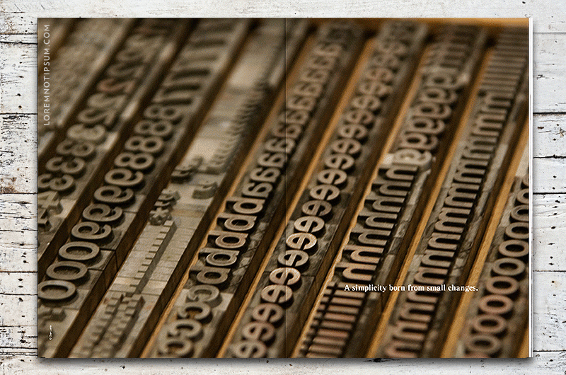
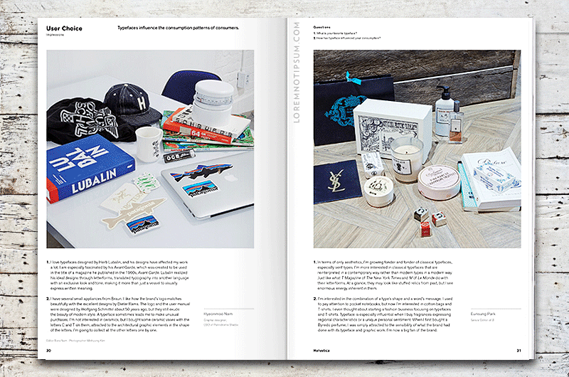
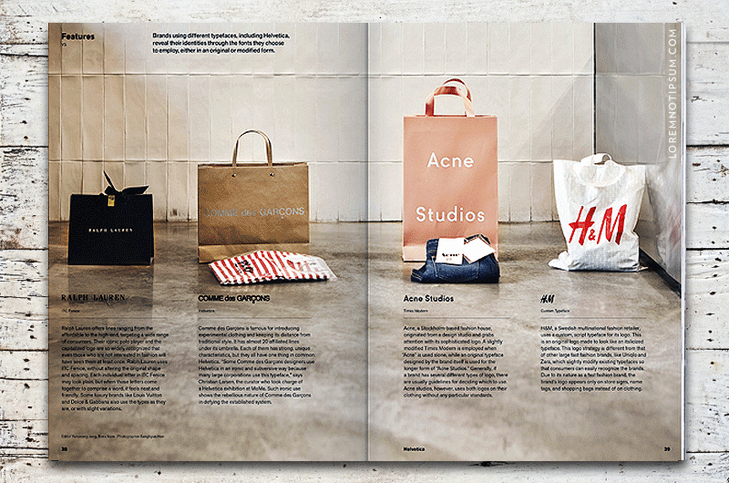
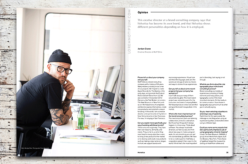
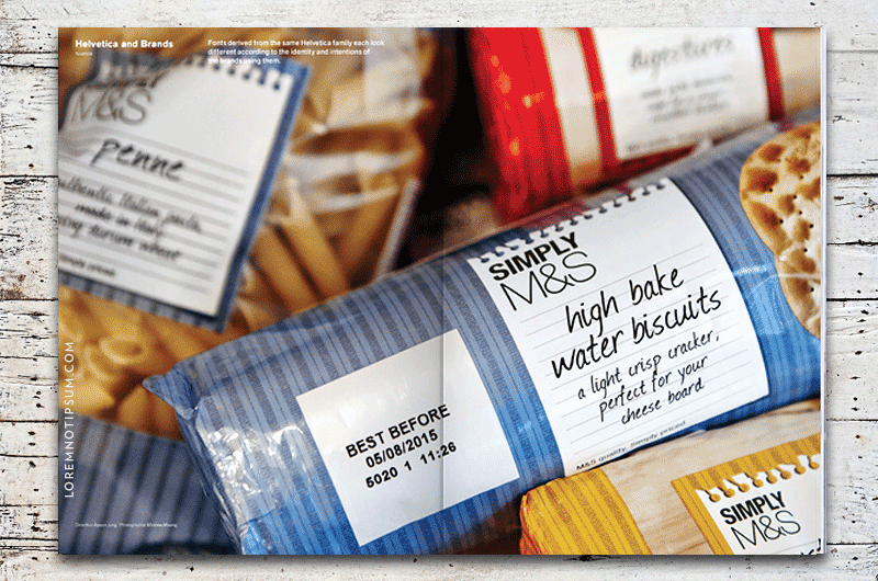
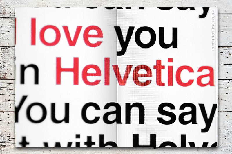
Magazine B Issue 35 (Helvetica) is available now at LOREM (not Ipsum). Helvetica is a typeface that was first developed in 1957 by the Haas Type Foundry in Münchenstein, Switzerland. Created to meet the social demand for practicality in 1950s, Helvetica was made to be more functional than decorative.
This product is sold out, but you may also like:


Original price was: CHF 117.00.CHF 93.60Current price is: CHF 93.60. (incl. VAT)


Out of stock
Want to be notified when this product is back in stock?
You may also like


Zurich Magazine Volume 2 (Fantastic People) is out now and available at loremnotipsum.com. Volume 2 features Ella Rumpf, HR Giger, Tosh Basco, The Italians of Zurich, Walter Pfeiffer, Gianni Jetzer, Mitchell Anderson, Francesco Cagnin, Camille Vivier, Lorenza Longhi, Enzo Enea and Wu Tsang on the cover.


Balcony Magazine Issue 2 is available now on loremnotipsum.com. This iteration of balcony embraces closeness. It dances within the liminal spaces that exist between people. These are relationships of grand intimacy and sometimes imperceptible scale.


Magazine B Issue 49 (Netflix) is available now at LOREM (not Ipsum). Started in 1997 in Silicon Valley, Netflix was dubbed the icon of American popular culture following the success of its DVD-by-mail operation. 10 years after the DVD-era, during which the Netflix-logo-emblazoned red envelopes reigned supreme, Netflix introduced its movie and TV show streaming service and burgeoned into an online entertainment powerhouse.
–15%


Eldorado Experience Two is here and features a surf trip to Panama. With photography by Dizy Díaz, drawings by Ángela Palacios & art direction by Folch, the publication documents all aspects of the journey across untamed beaches, hot waters, lonely waves, torrid sun and mosquitos, seeking authenticity and good tides in the enchanting Central America country.


Sunday Magazine Issue 0 is available now on loremnotipsum.com. The pilot issue is available now at LOREM (not Ipsum). Sunday Magazine is an independent motoring magazine focusing on slow journalism. Full of enigmatic reporting and dazzling photography.


Montamont South Tyrol Guide (English) is available now on loremnotipsum.com and guides you to 45 of the best places to stay the region has to offer. South Tyrol is where north and south, German and Italian, Alpine and Mediterranean all come together.


Auslöser Magazine Issue 5 is available now at LOREM (not Ipsum). Auslöser Magazine is a biannual, bilingual (German & English) indie print magazine from Vienna (Austria) that focuses on the human stories behind the camera. Each issue features four in-depth photographer interviews, one company portrait behind the scenes and one camera in detail.

Another Gaze Issue 4 includes essays about Madeline Anderson, Lorenza Mazzetti, Laure Prouvost, Ben Rivers & Anocha Suwichakornpong, Agnieszka Holland’s Spoor, Susan Sontag's filmmaking career, Storm De Hirsch, Zia Anger, Ashley Connor, Bruce LaBruce, Pina Bausch/Chantal Akerman, Magdalena Montezuma, Rebecca Horn, Anne Charlotte Robertson, Zhu Shengze, Beatriz Santiago Muñoz, Maya Da-Rin, Camila Freitas, Gong Li.
–30%

Wallpaper Magazine November 2021 is available now on loremnotipsum.com. Nine years ago, when Cao Fei first featured in the pages of Wallpaper*, she was already at the forefront of technology, but relatively unknown among an audience that wasn’t familiar with the Chinese art scene.


Lindsay magazine No. 5 is here and travels to the mountains via the paintings of Etel Adnan, along coastlines wherever waves roll in, and then all over the world through the photographic archive of Lindsay James Stanger. We celebrate the history of hair braiding in South Africa, Salasacan weaving techniques in Ecuador, Vedic jewellery traditions and the new sound of Ukraine.


Where the Leaves Fall Issue 5 is here. The themes for this issue focus on water, technology, and cosmos, alongside a series of dialogues.